
Today marks the deadline for design submissions for New Zealand’s national flag. No one has decided that we will be changing our flag yet. It might not happen at all, but submissions have been accepted for consideration.
As a designer and a tax payer, I agree that redesigning the flag is inevitable and something to think about for our future. Our flag is outdated and doesn’t reflect our nation. Still, changing the flag is an expensive, unpopular exercise we don’t need right now.
Design by committee is never a good idea and generally speaking, crowd sourced design is terrible. The panel of judges was appointed by the government from nominations and represent a broad range of New Zealanders. There are no designers in the panel, though the panel have expressed that they will be consulting with advisors including design and cultural experts.
Design by designers and selection by an experienced panel could work. But submissions accepted from anyone with an internet connection and selection by a cross section of people will be far more unpredictable. The sheer number of entries has been overwhelming and predictably range in quality. Buzzfeed posted a list of 20 best shockingly terrible flag designs which for entertainment’s sake you can view here.
There are some designs that are actually pretty sweet so I thought I would put together a round up of those submissions. Some of these have been submitted by real life designers (yay!), in which case, I’ve included links to their work.
10 New Zealand flag designs that don’t suck

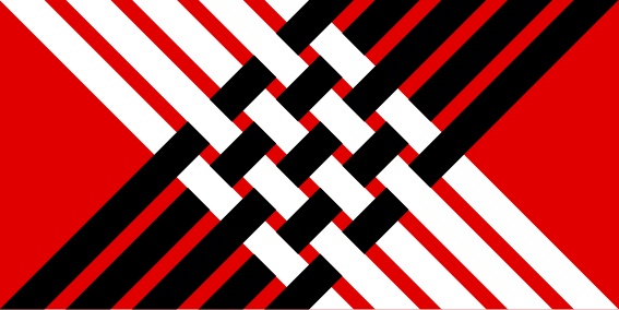
Tukutuku 04
Designed by: Kris Sowersby from Wellington
Kris is an internationally recognised typeface designer based in Wellington and has submitted many designs to this project, although this was my favourite. You can view more of his designs and also submissions inspired by his designs here.

Raranga/Weave 12
Designed by: Pax Zwanikken from Nelson
Woven strength
Designed by: Gerbrand van Melle from Auckland

Maori AH1 2×6 Flag V02
Designed by: Peter Ataahua from International

Sense of Place_ # 5 (looking back, moving forward)
Designed by: Cameron Gibb from Auckland

Interpretations of the Southern Cross 1
Designed by: Ilker Yoldas from International

TBC
Designed by: Tom Parkes from Wellington

The Cross of Spheres
Designed by: Sam Stradwick from Auckland

New Horizon 4
Designed by: Phillip Bannister from Auckland

The Direction Home (silver)
Designed by: Michael John Hill from Auckland
I would be happy with any of these designs as our national flag. Would you?
You can check out these designs and more over on the official submission gallery here.

I have seen some pretty….how to say this…. pretty rubbish designs for the flag, but I know half of them are actually taking the piss.
These here, are all beautifully designed and I think some of them would look amazing as the national flag.
Jules.- http://thekiwidiaries.com
That buzz feed list was hilarious, thanks for linking! I really like all the designs you’ve posted as designs but not so much for flags. I’m still kind of anti changing the flag, but am coming around to it if we can pick a decent alternative. I think my favourite design is the Kyle Lockwood one as I would like the flag to feature the fern but I think the colours should be red, white and blue.
I agree with Em that a lot of these designs here are good DESIGNs, but not good FLAGs. They are more like artworks, logos or brands, than national flags.
The only ones here that do stand out for me as flags are ‘Sense of Place’ and ‘Interpretations of the Southern Cross’ (the latter being my favourite, and I think is a stunning flag).
Disclaimer: I’ve also submitted a few designs myself … but none as good as ‘Interpretations of h Southern Cross’.
I really liked the ‘sense of place’ design. I think we need to keep the Southern Cross in the flag design, and that’s the only submission I’ve seen that I would actually be happy with as a flag – probably because it doesn’t seem like it’s totally wiping out the old design.
These are way better than the 40!