All posts filed under: Graphic Design

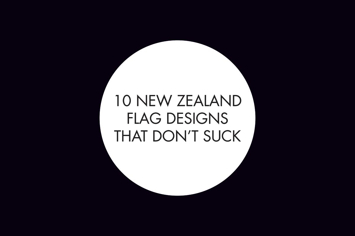
10 New Zealand flag designs that don’t suck

Today marks the deadline for design submissions for New Zealand’s national flag. No one has decided that we will be changing our flag yet. It might not happen at all, but submissions have been accepted for consideration. As a designer and a tax payer, I agree that redesigning the flag is inevitable and something to think about for our future. Our flag is outdated and doesn’t reflect our nation. Still, changing the flag is an expensive, unpopular exercise we don’t need right now. Design by committee is never a good idea and generally speaking, crowd sourced design is terrible. The panel of judges was appointed by the government from nominations and represent a broad range of New Zealanders. There are no designers in the panel, though the panel have expressed that they will be consulting with advisors including design and cultural experts. Design by designers and selection by an experienced panel could work. But submissions accepted from anyone with an internet connection and selection by a cross section of people will be far more unpredictable. The sheer number of entries has been …

Edible Type

#NZbloggers are hosting a weekly blog post challenge. This week’s theme is Type and you can check out other posts on this theme here. I am a typography geek. I’m the kind of typography geek who yells out font names during the opening credits of movies. It’s a annoying weird habit. When I saw this week’s Type theme, I knew it had to be something to do with my obsession with typography. Here’s a round up of edible type from around the inter webs. Sugar for Stefan Sagmeister “If I want to explore a new direction professionally, it is helpful to try it out for myself first” Credit: Marian Bantjes http://www.bantjes.com Salt to taste Credit: Kim Vu http://www.posttypography.com Type Is Sweet Credit: Danielle Evans http://www.marmaladebleue.com Humble Pie Credit: Danielle Evans http://www.marmaladebleue.com I Love You More Than… Credit: Danielle Evans http://www.marmaladebleue.com Hungry For Adventure Credit: Danielle Evans http://www.marmaladebleue.com I’m Just A Little Bit Chili Credit: Becca Classon http://www.beccaclasson.com Fresh Credit: Becca Classon http://www.beccaclasson.com Oats Credit: Becca Classon http://www.beccaclasson.com 3D type: Toasted Credit: Yani Arabena and Guille Vizzari (font) and The Six & Five Studio http://www.yaniguille.com, www.sixnfive.com Shit …

Monday Bunday: Schipper’s Beer

    Schipper’s beer is a tiny brewery based in my neck of the woods. The brewer is a local photographer with a passion for food and beer. Schippers have delightful branding including this armed and dapper magician for Schipper’s Herr X Vienna Lager. A complex but elegant lager with subtle cherry and raisin aromas. 80’s music nerds will be interested to note that Herr X is the B-side of Ultravox’s Vienna. Illustrations by Paul Densem at Teaspoon Films and design by Gunroom. You can see more work by Gunroom and Paul Densem here and here. Find out more about Schipper’s Beer on their Facebook page. All images property of Schipper’s Beer.  

Monday Bunday: Suerte Tequila

Tequila and I have a mutual respect. Really good tequila, the stuff that is classier than me, has my respect. The trashy stuff that needs a wince and a chaser, I can do without. The tattooed rabbits on these bottles of tequila from Suerte were designed by tattoo artist Adam Jackson. Suerte means “luck” in Spanish and what is luckier that a tattooed rabbit? Visit Adamamnts.wordpress.com for more Adam’s goodies. Design company Swig Studio are responsible for this beauty. See more of their work here: http://www.swigstudio.com Love bunny things? Check out more editions of Monday Bunday here.   

Monday Bunday: The Welsh Rabbit Cheesery

This restaurant branding for The Welsh Rabbit Cheesery by Candy Coated Universe is smart and sassy. I love the nod to vintage design as well as the twee rehash of classic tattoo art. The limited colour palette with touches of red is very chic these days. I hope this look is here to stay. The twine and brown paper packaging with rubber stamp make me pine for cheese. Oh no wait, I pine for cheese just fine on my own. See more work from Candy Coated Universe at their website here. This project was designed for Tenfold Collective who I’ve blogged about before and are also tickled by bunny shapes.

Design at The Food Show

I’ll be honest. I buy food and wine that has beautiful packaging. My pulse quickens, I may gasp aloud and I’ve been known to squeal with delight. I am an absolute sucker for pretty bottles, labels, quirky illustrations and unique materials. As a print designer who also happens to be obsessed with food, I would love nothing more than to design just for the food. All day, every day. Heaven. Yesterday at The Food Show was like food design geek OVERLOAD. So many lovely designs. So little time. It was a lovely surprise to see The Good Tempered Chocolate Company at The Food Show. The ornate, hand drawn logo I designed for Hayley was on display for everyone to see. Excite! Hayley’s hand made chocolates are to die for and she sweetens me up by bringing me her wonderful treats to sample. I had the pleasure of trying her new Peanut Butter Deluxe Chocolate a few weeks ago and she launched it at The Food Show. Hayley shared a stall with Pic’s Really Good Peanut Butter. The …

Monday Bunday: Bunny Bar

Bunny Bar packaging and branding by design company Strohl, makes use of cute doodles and sweet typography to give these snacks an organic, handmade feel. Part of a more refined brand, this product was to appeal to a younger market. Each pet bunny is colour coded to represent each of the different flavours: Mimi Merry Mango Strawberry, Squeaky Cheeky Choco Cherry, DeeDee Dot Cherry Apricot and Rocco Choco Banana. The founder raised 18 pet rabbits as a child, hence the company name: 18 rabbits. I’d buy these.

Semi-Permanent 2012

A decade ago, the year Semi-Permenent set up a chapter in Auckland, I was a bright-eyed, bushy-tailed, first-year design student. I had just started going out with The Koala and when we heard about a new, fledgling design conference we purchased our precious tickets. For a student, even the concession ticket was a lot of money. The Koala and I attended the very first NZ Semi-Permanent event at the Bruce Mason Theatre in Takapuna and we were blown away by the world-famous calibre of creative speakers. Since then, I’ve barely missed an event. I think I’ve missed two. One because we were saving our pennies for our wedding and another time we were out of town. Semi-Permenent took a break from our shores last year, but this year they are back and on in just a few weeks! I won’t be in Auckland so I won’t be attending this year. But if you are around, you should check it out. The two day event runs on 18 and 19 May 2012 at the ASB Theatre at …

Monday Bunday: Jose Ortiz

This illustration by Jose Ortiz for client Linguagraphics makes me smile. Black cats and white rabbits are both recognized for their magical properties. The black cat as a witch’s familiar and the white rabbit as the magicians sidekick. Jose’s slick portofolio has a clean, cool finish and bears the hand of a perfectionist. His work can be found on his website www.jofolio.com.

Monday Bunday: Hare’s Bride Beer

Beautifully illustrated label by Tenfold Collective for Grimm Brothers Brewhouse beer: Hare’s Bride. The label is adult and whimsical without being twee. A man wouldn’t be afraid to hold this in his hand. This label is printed using white and black inks on top of a silver foil. A high alcohol content beer, this is sure to knock the bride off your hare. Bonus: Look for the animated rabbit over at the Tenfold website! Via The Dieline.