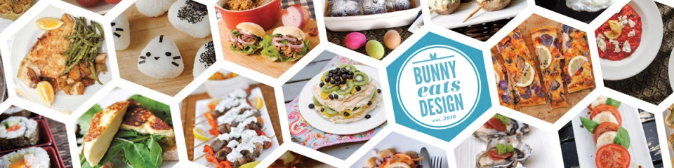

 August was a foodie month of epic proportions. Auckland Restaurant Month inspired me into a frenzy of dining out. While this blog isn’t really a restaurant review website, I wanted to celebrate some of the great local food we have here in Auckland, New Zealand. I posted a review a day while all regular features went on hiatus. I know some of you missed my regular features, but I hope you enjoyed the special month…I know I did!
 Some of you may have noticed part-way through August, I revamped this blog with a fresh, simplified template. This theme is called Isola by Joen Asmussen for Automattic. I picked it for it’s uncluttered design which allows me to feature my photos. For those of you who are looking for links and widgets, they’re still there, just a button click away at the top of the page. Click or tap on the Blog theme since updated to Zuki by Elma Studios (16 January 2015). menu button (highlighted here in yellow) to find my pages and extra bits and pieces.
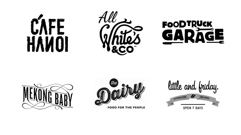
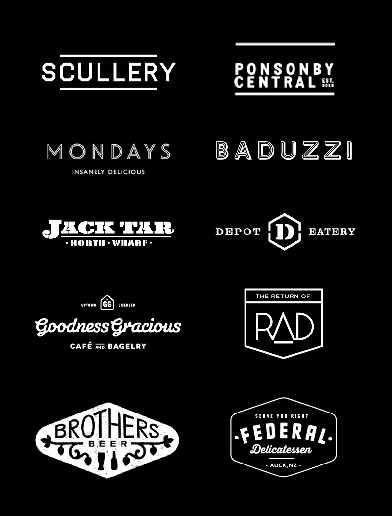
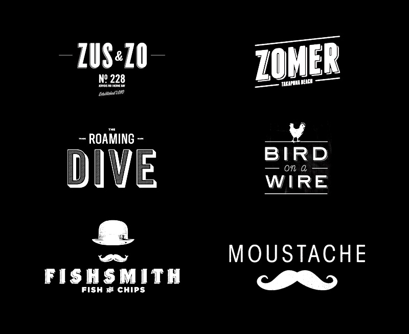
As a graphic designer, I always look at logos, menus, signage and decor a little longer and a little harder than is considered acceptable. I can’t help it. While enjoying our local cafes, bars and restaurants last month, I came across many trendy logos which some designers might call “The Hipster Logo” trend. The Bunny Eats Design logo could be categorised as part of this trend. The trend is hard to define but regular motifs include: Circles, X-style crosses, arrows, horizontal lines, banners and badges. Pictograms or icons include: Cutlery, knives, moustaches, tools, guns, bowler hats, anchors and glasses. Fonts include: capital sans serifs, script fonts, heavy slab serifs and stencil fonts. Text can be stacked, arched, skewed or just plain ass text. A Google Image Search of Hipster Logo comes up with specific examples. This style of logo is everywhere and particularly prolific in food related industries. I thought it would be interesting to hunt down these logos to show a glimpse of this trend as it is happening. Here is a round up of some of my favourite hipster logos in the current Auckland culinary landscape. Please note these are real logos in use. I do now own copyright of them and I did not design any of them (except for the Bunny Eats Design logo). 


You may not be a review website but damn, you just do it so effing well! 🙂
I love how your logo has bunny ears. I loved seeing all these logos, thanks. Maybe I should invent a hipster logo for mine….
Love the new layout. And what a great selection of logos, it’s so nice seeing them side by side! My favourite will have to be Rad!
I love finding a new cafe – somewhere I can read and write in a good atmosphere – such as Quay St cafe or Gloria Jeans by the library. Do you know of any really special cafés I should try out? X
I love this- the title just made me laugh. It’s funny that when you put them together, the trend is so apparent. But I can understand why, they are so effective and ultimately, pretty to look at!