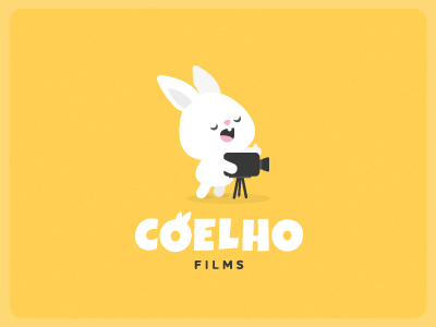
Monday Bunday: Coelho Films
How adorable is this branding project? Coelho means “rabbit” in Portugeuse and Coelho Films represents a cinematographer from Brazil.
How adorable is this branding project? Coelho means “rabbit” in Portugeuse and Coelho Films represents a cinematographer from Brazil.
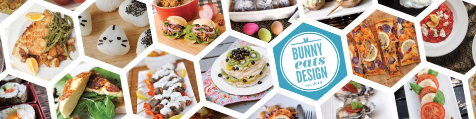
August was a foodie month of epic proportions. Auckland Restaurant Month inspired me into a frenzy of dining out. While this blog isn’t really a restaurant review website, I wanted to celebrate some of the great local food we have here in Auckland, New Zealand. I posted a review a day while all regular features went on hiatus. I know some of you missed my regular features, but I hope you enjoyed the special month…I know I did!
The Forgotten Rabbit logo re-design by Jorgen Grotdal via Behance. Jorgen is a 17 year old logo designer based in Norway. Retro, vintage, hipster logos galore, he is a bit of a one trick pony, but he does the one trick very well. See this and more of his works on his website jorgengrotdal.com

A varmint is a troublesome wild animal. The total opposite of Tofu the bunny who is a sweet domesticated confidant. This Little Varmints identity design by Ashley Dugan caught my eye the other day. Little Varmints is a clothing brand based in Big Spring, Texas. Ashley’s graphic design style is beautiful typography and whimsical vector illustrations although she also dabbles in fine art. Check out this and more of her graphic design work on her Behance portfolio here: https://www.behance.net/ashleydugan or her website here: http://www.ashleydugan.com/ Without sounding stalkerish She also has impeccable taste. Find out just how impeccable over on her Pinterest page here.
The Rarebit is a cool spot for the people of Charleston, South Carolina, USA. Designed by Jay Fletcher who has a huge portfolio of very slick, drool-worthy logos. See this work and more at Jay’s website: http://www.jfletcherdesign.com So much whimsy in a very cool, not at all girly design. Quite often restraint is more powerful in design than showing everything you’ve got. And because this is still a food blog, here are some yummy photos by Jonathan Boncek for The Rarebit.
My search for bunny logos and branding never ends. But if it did, it might end at Hello Tomato’s identity design for Run Rabbit. Hello Tomato is Sasha Heath, an illustrator based in Melbourne, Australia. Hello Tomato has also done work for last week’s Monday Bunday The Woodsfolk. You can view more Hello Tomato goodies here: http://www.hellotomato.com.au Love bunny things? Check out more editions of Monday Bunday here. P.S Please check out her doodle/tatto style rabbit lamp and rabbit light. They are really, very cool. Looks like a fun project to get my own mitts on.
The Woodsfolk is a homeware store in Melbourne, Australia and I’m in head over heels in love with their whimsical branding by US based Stitch Design Co. If you like the current trend of vintage/hipster styler design, Stitch Design Co. really embodies this aesthetic. I love how they’ve just gone with black and white. I would be super tempted to do this in full colour but the monocrhomatic logo It gives it a more adult, chic feel where colour would have appealed more to children. Also, their shop is bursting with colourful items so the white washed walls and monochrome branding really works. A rare geeky treat, Stitch Design Co also posted their logo process concepts here. Designers don’t usually show the world all the process concepts but it’s always great to see what other ideas were explored and rejected. If Hawthorn, Melbourne is in your hood, check out The Woodsfolk’s brick and mortar shop at 39 Church Street. They are open 7 days! Going by what I’ve seen online, it’s a treasure trove of beautifully …

As a graphic designer I have designed a few restaurant logos and I am always hoping to design more. I am still looking for that elusive bunny foodie client. Until then, here are some of my favourite bunny restaurant logos from around the world. Clicking on images will lead to the source. In no particular order…
A celebratory logo redesign by Preuss und Preuss, Berlin, Germany for the zoo in Cologne, Germany. The elephant logo is the regular logo, the bunny version is the special Easter edition of the logo. I like the concept, but not the execution. The rabbit looks like he has head tilt which is a serious condition for bunnies.
For those that like their sushi and their logos to be served together, here are some yummy logos to feast your eyes on. The best sushi logos from over at logopond.com. sushimasters by tvaric. Simple, sexy. Tsunami Sushi by CityOnFire. logo for Tsunami Sushi Wasabi by paxilixap. Isn’t this typography hot? Kamon Sushi by GreenInkStudio Bento by toytea nimoe sushi bar by brandclay I’m not convinced that Nemo is a good character to sell sushi, but who knows? Denshu Sushi by rsek http://www.tomhuveners.net Sushi Box by rkfinnegan Osaka by rkfinnegan. Elegant and refined. Sushi Heaven by AdamTheNumberOneMan
Travel, Food, Photography, Writing, Motorsports
Recipes so Good no-one will know you're Cheap!
A beauty and lifestyle blog
Life, Family, Food and Fun!
Low histamine recipes
